
Form vs. Function in Product Design

In the bustling alleys of the startup world, where agility and innovation are kings, a debate has been quietly raging on – should a product's design prioritize form or function? For some, the allure of a beautifully crafted interface or a sleek physical design is irresistible. For others, the gritty nuts and bolts of pure functionality trump all else. And then, there are those who seek the golden mean, attempting to marry the best of both worlds.
The allure of form: Ello's design-led user experience
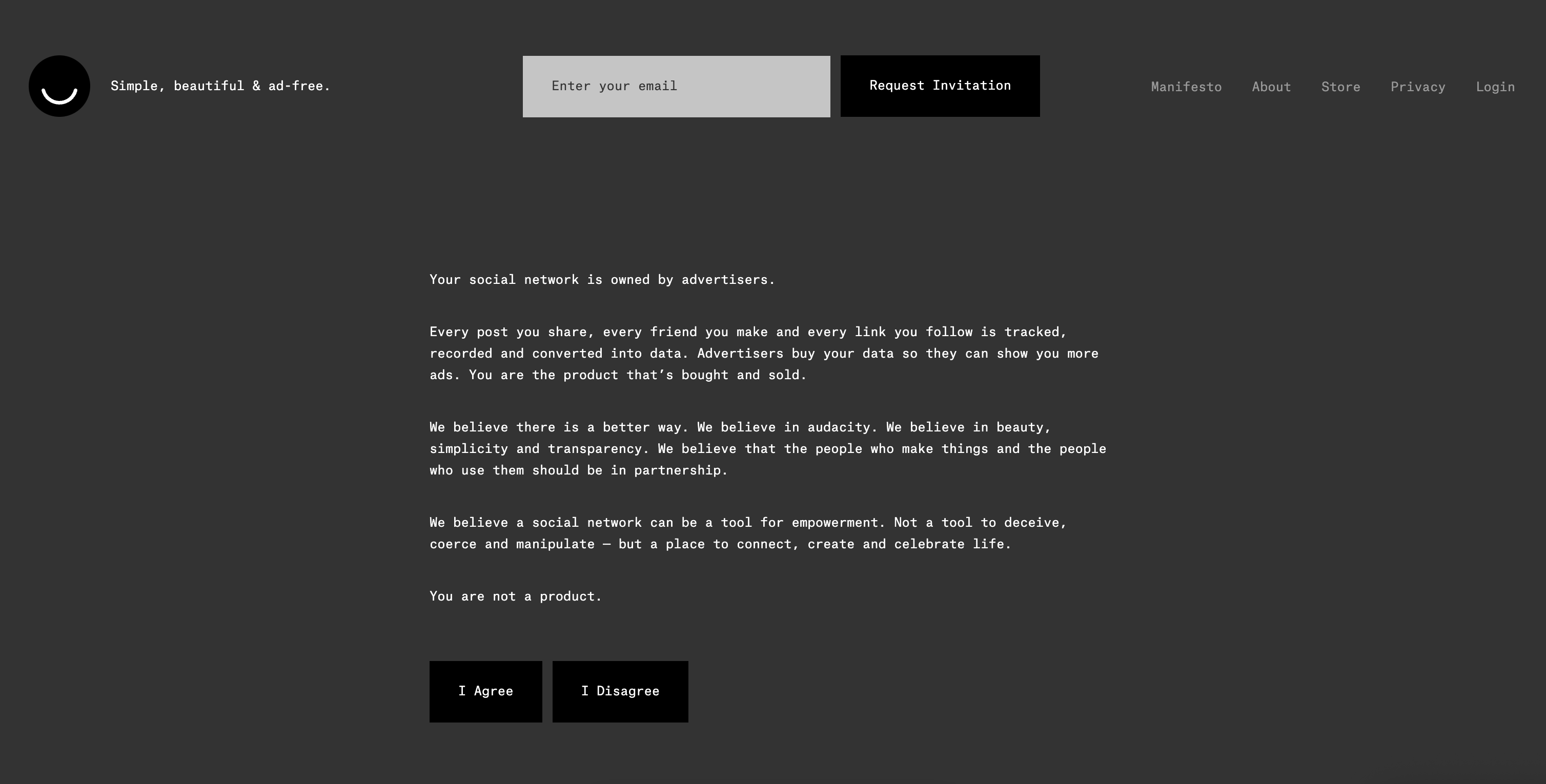
Ello initially launched as an invite-only platform, branding itself as the "anti-Facebook." Its USP was clear: no ads and a staunch commitment to user privacy. This was set against a backdrop of growing discontent with mainstream platforms due to perceived invasions of privacy and ad overload.
Ello's design was undeniably a departure from the norm. Its minimalist, almost artistic layout was a stark contrast to the busier interfaces of its contemporaries. This distinctiveness had several advantages:
Standout identity: In a sea of look-alike platforms, Ello immediately differentiated itself. This uniqueness was a significant draw for users looking for something different.
Attracting a niche audience: The design-centric approach resonated with creators, artists, and designers. Ello became a space for this community to showcase their work in an environment that mirrored their appreciation for aesthetics.
Reduced cognitive load: The clean interface, devoid of ads and extraneous content, meant that users could focus solely on the content. This reduction in distractions can enhance user engagement with the presented content.
Positioning as an ad-free alternative: Ello's design wasn't just about aesthetics. The lack of ads, which also meant more space for content and less visual clutter, positioned Ello as a platform that prioritized user experience over monetization.
The power of function: Craigslist's spartan design
While a minimalist design has its appeal, some platforms have succeeded with almost no design emphasis at all.
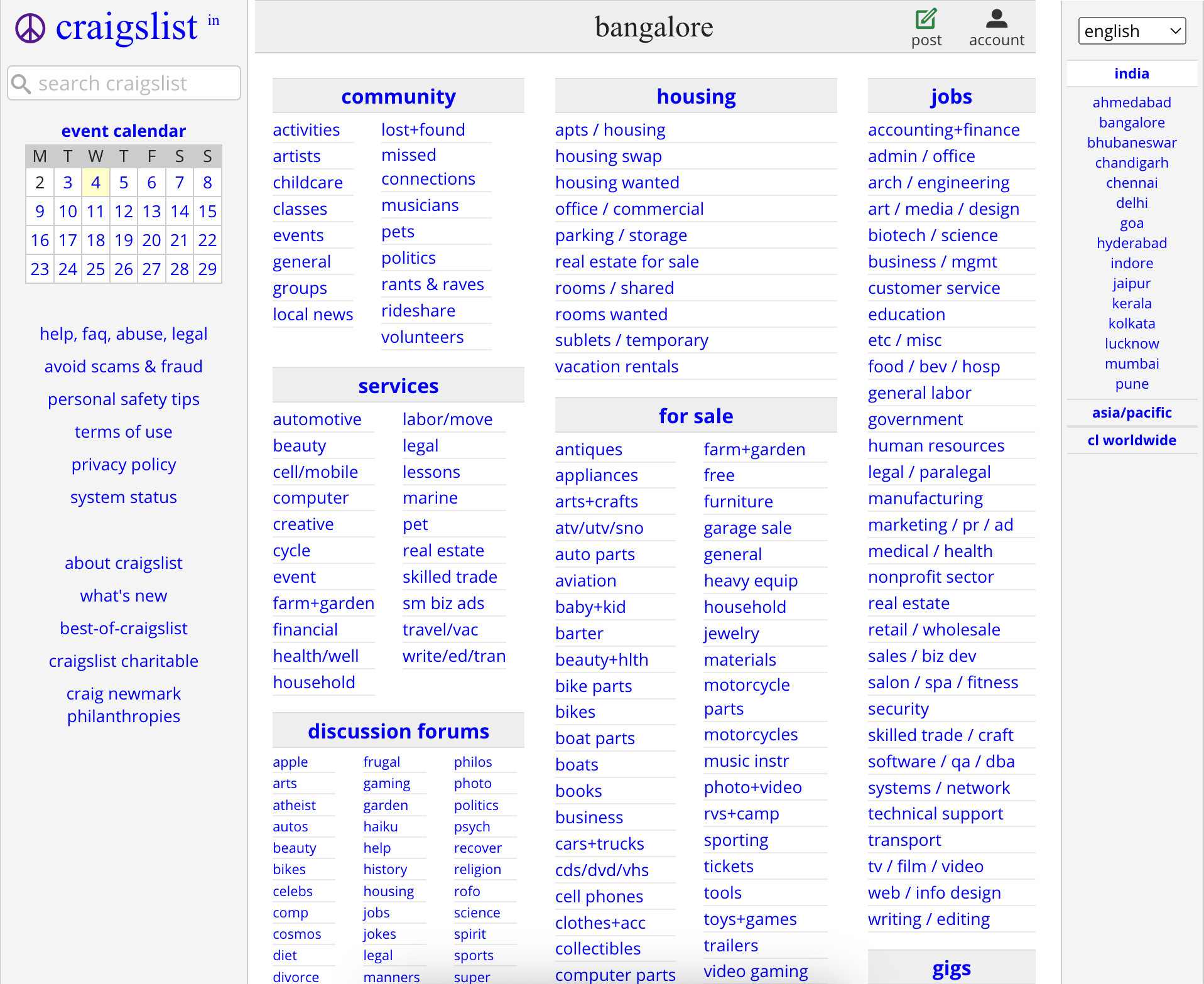
Launched in 1995 by Craig Newmark, Craigslist started as an email distribution list for friends, featuring local events in the San Francisco Bay Area. As it transitioned to a web-based service, its design ethos was clear: plain, straightforward, and undistracting. The interface is predominantly text-based, with hyperlinks directing users to various categories and listings.
Why such a spartan design works for Craigslist
Rapid loading: One of Craigslist's most underrated advantages is its lightning-fast loading times. With minimal images and a lack of heavy design elements, pages load quickly, even on slower connections.
Universal accessibility: The site's simplicity ensures that it's accessible on a wide range of devices and browsers, including older ones. This broadens its user base, particularly in regions or demographics with dated tech infrastructure.
Focus on content: Without flashy graphics or intricate layouts, users can focus solely on the listings. This no-frills approach ensures that the content – the primary reason people visit the site – remains the focal point.
Ease of use: Posting or searching for a listing on Craigslist is straightforward. The platform's simple structure means there's virtually no learning curve, making it user-friendly for people of all ages and tech proficiency levels.
Marrying form and function: Airbnb's balanced approach
When Airbnb was conceived, its founders, who had backgrounds in design, aimed to create a platform that felt personal, trustworthy, and intuitive. The challenge? To marry this vision with a robust, functional platform that caters to both hosts and travelers.
Aesthetically pleasing yet functional
From the outset, Airbnb's interface felt different from other booking platforms:
Imagery: Airbnb placed a significant emphasis on high-quality photos. Recognizing that travelers resonate with visuals, Airbnb even offered professional photography services to hosts. These images don't just beautify the platform; they provide essential information about listings, making them a functional aspect of the user experience.
Streamlined user journey: Airbnb's site and app design guide users with intuitive ease. Whether you're listing your space or looking for a place to stay, the platform ensures clarity at each step. This clarity, achieved through thoughtful design, streamlines the user journey from browsing to booking.
Review system: While reviews are standard across many platforms, Airbnb's design places them front and center, making them easily digestible. This design choice is functional, helping potential guests quickly gauge the quality of a listing.
Adapting with feedback
Airbnb's design evolution has been marked by its responsiveness to user feedback. For instance:
Interactive maps: Airbnb incorporated a map view alongside listings, allowing users to visually and functionally engage with the location aspect of their search. This tool aids decision-making, allowing users to select accommodations based on proximity to landmarks or specific areas.
Experiences: When Airbnb expanded to offer "Experiences," the design echoed the main platform but with tweaks. Rich visuals coupled with detailed descriptions provided users with a clear sense of what each experience entailed.
My thoughts
There's no one-size-fits-all answer. The decision to prioritize form, function, or both depends on the startup's goals, target audience, market dynamics, and sometimes, even budget constraints.
However, in the dynamic and ever-evolving world of startups, adaptability is key. Recognizing when to pivot, when to prioritize one over the other, or when to seek a blend can be the difference between fading into obscurity and emerging as an industry leader.
What's undeniable is that both form and function have their place in the product design world. The challenge for startups is to recognize where they fit in this spectrum and to craft their design strategies accordingly.
What are your thoughts? Have you come across products or platforms where design seemed to overshadow functionality, or vice versa? Share your experiences and let's discuss the balance between form and function in today's digital landscape.